Design Thinking Notebook · Stage 5 of 5

no rules, just choices
Stage 5 · Test
We put Optional in front of others: a hard-nosed AI focus group and three real testers, then turned what we heard into changes we can point to. Here's the whole story.
AI Focus Group
Three tough voices, told never to flatter us.
We built a simulated panel of three people from our target audience and instructed them to behave like a thesis review council: objective, critical, and never complimentary. Each one carried a backstory pulled straight from our research.

Gerald
The Precarious
Coping Profile
38, unemployed. Reaches for cheap beer and scratch-offs to escape financial anxiety. Refuses to be treated like "a project."
Flagged: the app is reactive, so it never catches him during the drift.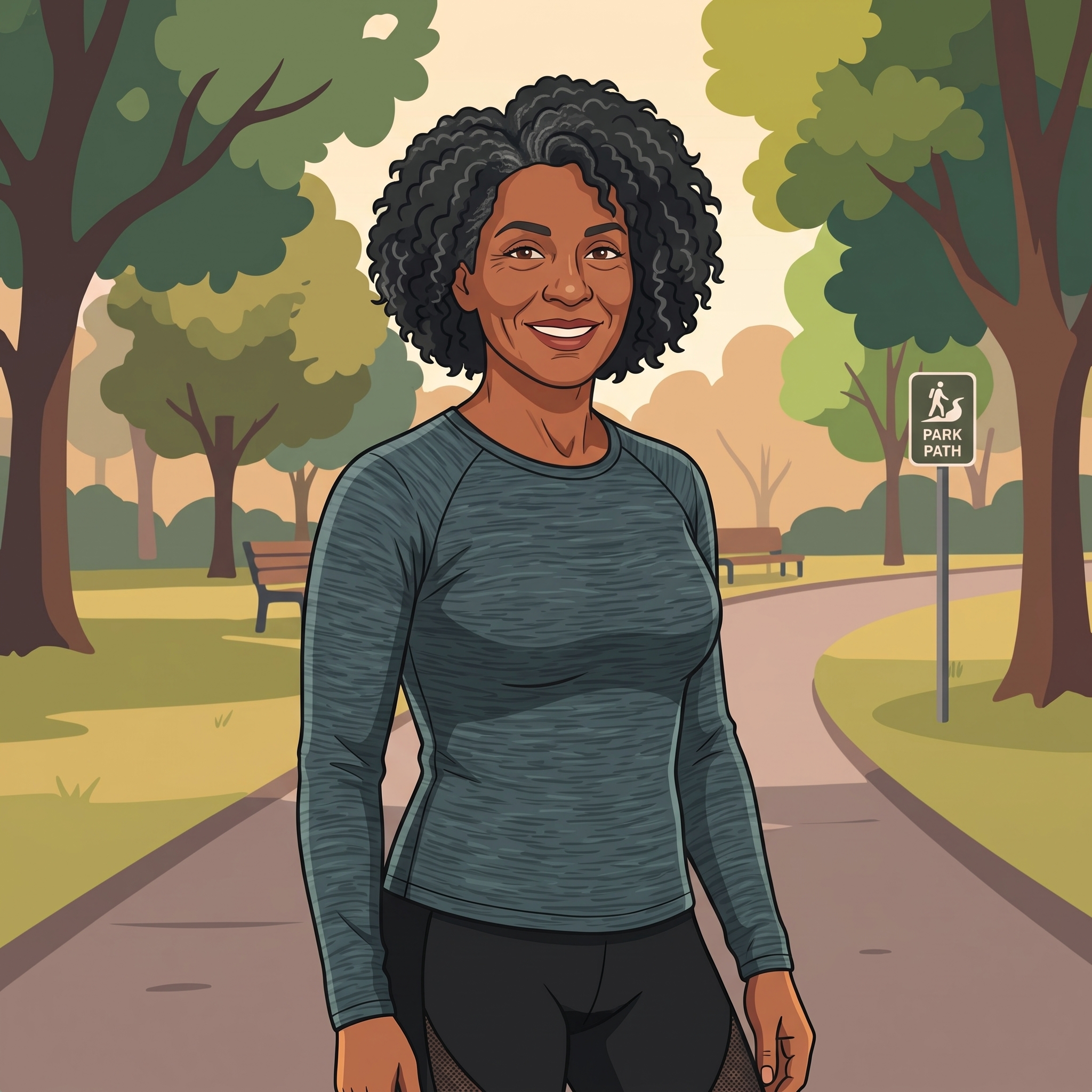
Kai
The Socially-Approved Compulsive
58, trans woman, art teacher. Over-exercises on a damaged hip to escape loneliness. Her vice hides as "discipline."
Flagged: a vice-neutral menu can prescribe someone their own vice.
Genovese
The Exhausted
Caretaker
33, immigrant single mother, 14-hour days. A cigarette is her only self-owned five minutes. Zero energy to spare.
Flagged: "Don't share" lets the most exhausted user skip the whole point.What the panel drove home
The panel affirmed that our "choices, not problems" framing genuinely widens who the app can serve, but converged on one core gap: the build was a manual menu people had to remember to open, while the promise was an attentive companion that catches them at their own upstream moment. Gerald wanted something proactive before his danger hours. Kai needed the menu to stop handing her the very thing she reaches for. Genovese needed the front door to cost less effort, and the content to assume less time, money, and mobility than she has.
Real User Testing
Three real people. The same front door tripped all of them.
We handed the prototype to three real testers and gave each a task. What's striking is that the humans confirmed the same problems the AI panel found, just at the very first screen.
Task: Find the companion and tell it how your day was.
Couldn't tell what "the companion" even was, or why it mattered. Expected it to suggest things to do, and felt it didn't respond to her.
"I didn't understand why it was essential."
Task: Find the chat rooms and pick a room.
Stalled on the first screen. "Share or don't share, what does that mean?" Chose Share, landed on the Companion, and wasn't sure what to do. Liked the relaxed "sanctuary" vibe once oriented.
"What does that mean?"
Task: Explore the app freely.
"What is this? Share what?" Once he understood it was asking him to share how he's doing, he skipped it: too personal, too soon, before he trusted the app. Found navigation easy otherwise.
"Share what?"
Feedback Synthesis
Group it, spot the patterns, rank what matters.
Every real-user session stumbled on the same opening beat: "Share / Don't share" read as unclear and, once explained, too personal too soon. Nobody understood what was being asked, or why, before being asked to answer it. That same vagueness showed up downstream: users didn't feel the app was catching them "in the moment," which echoed the AI panel's reactive-timing gap. The Companion, meant to be the heart of the app, was easy to bypass or wander past entirely, and several testers reached it without knowing why it mattered.
- Fix Share / Don't share: unclear what it means, and once explained, feels too personal too soon.
- Companion too easy to skip by: users reach it without knowing why it matters.
- App doesn't catch people in the moment: no clear reason or trigger to open it when it'd actually help.
- Language is presumptuous: assumes a shared understanding of the user's situation.
- Menu doesn't flex to a specific vice: one-size-fits-all, not tailored to what someone reaches for.
Changes & Rationale
Every change points back to a voice.
These are the changes we actually built into the prototype after testing, each one tied to the feedback that drove it.
A Companion introduction
Drove it: Whitney, John, DJ. "What is this / why does the companion matter?"
Without forcing anyone to share, we made the Companion a stronger presence: an intro screen that explains what it is and what it does, and lets people personalize it by giving it a name. Skipping and leaving stays available on every screen. We invite, we never force.
The Cue Alarm
Drove it: Gerald and testers. "Nothing catches me in the moment."
To help people catch themselves before autopilot kicks in, we added a Cue Alarm, a self-set reminder for the times they tend to reach, paired with the mind and body cues they want to notice.
A user-controlled filter
Drove it: Kai and Genovese. "The menu prescribes my vice / assumes time & money."
We gave people control over Options Near By: a filter to hide what doesn't fit and screen for free, local options, so the menu shapes to their situation instead of handing everyone the same list.
Warmer, less presumptuous language
Drove it: the panel's "choices, not problems" note.
We diversified the language and added more positive mood descriptors, so the app doesn't presume how someone's feeling.
See It Evolve
Three live versions. Watch the feedback take hold.
Iteration you can click through. Each version is a real, working build, from the barebones original to the current prototype with the important feedback incorporated.
Barebones
The original build. Straight into the app: no splash, no intro, nothing to explain what Optional was.
Open v1 ›Splash added
Our first answer to "people don't get what this is": a splash page introducing the concept, before the deeper fixes landed.
Open v2 ›Feedback in
The current prototype, with Companion intro, Cue Alarm, the working filter, and warmer language all incorporated.
Open v3 ›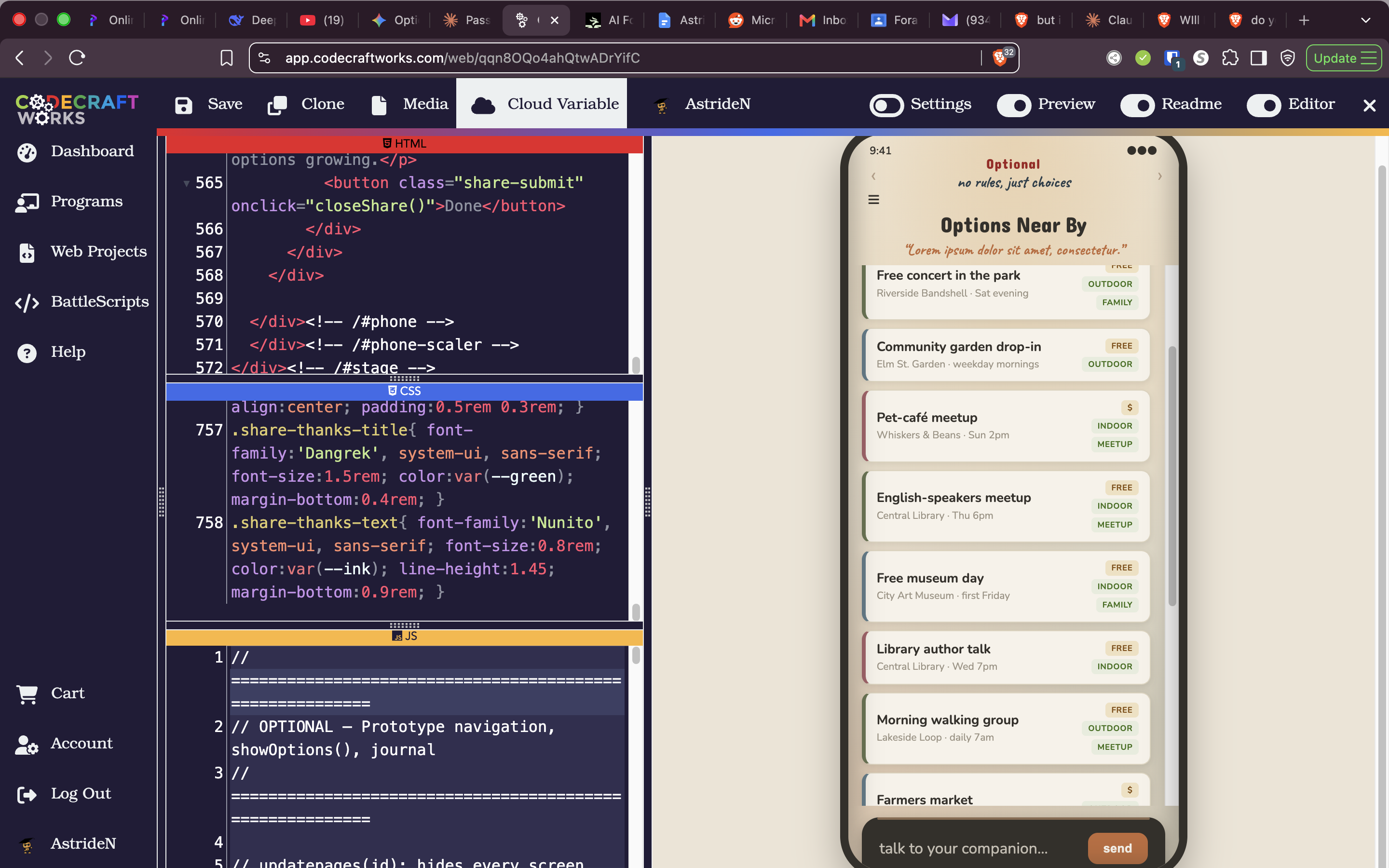
Where it landed
The current prototype opens on a warm check-in, introduces a companion you can name, and opens onto Options Near By, with Mind/Body, Chat Rooms, and a Knowledge Hub a tap away.
no rules, just choices
Optional
Stage 5 · Test — Design Thinking Notebook